Regrets: We Can Fix It! and Seconds

July 17th, 2014

Is there such a thing as an early life crisis? The mid-life crisis, with its restless hookups and material status symbols, is well-trod territory, but it’s the effect of sitting stunned in the car wreckage of a life, wondering just what happened that led to this moment. Is there a point in life just before the crash, when you can see the oncoming car or mailbox, and it’s not yet too late to swerve out of the way–but it will be if you don’t take control right now?

Both Bryan Lee O’Malley’s Seconds and Jess Fink’s We Can Fix It! occupy themselves with that moment. Both were written in their respective author’s early thirties, and concern protagonists of roughly the same age. It’s the age (which I share, being 33 years old as I write this) where you no longer quite feel that anything is possible, but the remaining field of potential isn’t yet suffocating. A co-editor of mine, also about my age, quit recently, and I can understand why; seeing the oncoming car, he decided to make a hard swerve.

Both Seconds and We Can Fix It! employ fantastic devices in mostly mundane settings. Seconds has its magic mushrooms, and We Can Fix It! has its time machine, and both function to the same end: to facilitate the protagonist’s desire to alter the past and live their “mistakes” differently. Naturally, this gives rise to problems in both stories, though the different nature of the obstacles is worth examining.

Seconds is a work of fiction which involves Katie, its heroine, finding a cache of magic mushrooms and instructions on how to use them to undo mistakes. The instructions double as rules: the bearer is meant to get only one mulligan, and it has to be something that occurred on the premises where the do-over kit is found. Naturally, Katie ignores one rule first and then the other–and then a third, totally unwritten rule–leading to disaster. Given the chance to rewrite her life, as her ex/boyfriend/husband Max says, she “started trying to make things better, and now […] can’t stop until things are perfect.”

Katie runs into trouble not just because she breaks the rules, but because the perfection she reaches for using the mushrooms is unattainable. The more mistakes in her relationship with Max she undoes, the further away her goal of owning her own restaurant seems to slip; her two dreams are revealed to be rooted in mutually exclusive choices. Katie has the power, at least for a while, to change whatever she wants, but no retroactive change can truly grant her desire. It isn’t until all her meddling is itself undone that she’s able to move forward in the life she built and forge it into what she wants it to be from there.

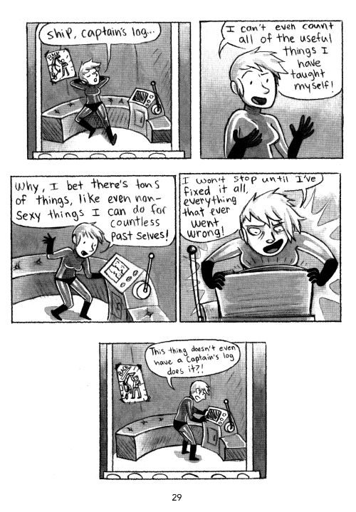
Unlike Seconds, We Can Fix It! is a loose autobiography; the time machine angle is more of a framing devices for the vignettes Fink presents of her past. The major stumbling block for Fink isn’t that she changes too much, but that she’s frustrated by her inability to change anything at all. Every time she zaps back to the past, her younger selves are either too confused or too headstrong to listen to any of her supposedly sage advice.

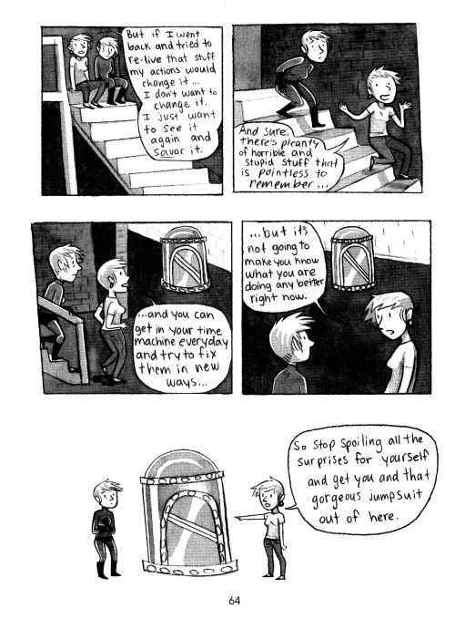
Although what Fink learns is that she can’t change the past, rather than Katie’s lesson that she shouldn’t, they both arrive at roughly the same place: an appreciation of their personal history. After some commiseration with her future self on where her plans went wrong, the last third of Fink’s “time travel memoir” has her revisiting the good times in her early life to prove to herself it’s not all as bad as she remembered. And either way, she finishes the story by returning to her caring spouse and fulfilling career, proving that even a rocky start doesn’t necessarily lead to a tragic end.

Not that Fink’s story is over, or Katie’s either. The terrible fear as we start to feel ourselves settling into a role, seeing the rest of our lives yawning ahead, that it’s all about to go wrong makes us anxious to look to the past to see how it might have been avoided, or how it might still be. In the grip of that fear, we forget that the specter of the coming crisis might only be that and nothing more. If we can find the courage to pay it no heed and keep driving, there’s an even chance things will work themselves out on their own.

Color and Violence in Cucumber Quest

June 5th, 2014

I follow or have followed a great many webcomics over the years, and even before this week’s run of strips, I would have felt comfortable saying that Gigi D.G., creator of Cucumber Quest, had far and away the greatest mastery of color of any of them. But the three most recent strips as of this writing show her stepping up her already insanely formidable game, and it’s worth looking at in more detail to examine how her colors advance the story.

The first strip is part of a transitional interlude between arcs. The last of the strip’s major baddies has just been defeated, and our heroes are on their way to the next kingdom to battle the next villain and win back the next Disaster Stone, as per the JRPG-like checklist of Cucumber Quest’s plot. (It’s not that simple, of course, but in broad strokes that’s what’s happening.) The last two times the protagonists needed to travel quickly, a strange young rabbit named Cosmo showed up with a convenient new invention to take them to their destination. Cosmo’s back here too, in the first strip of this triptych, and the first few panels are in Cucumber Quest’s typical palette of bright pastels, signifying business as usual.

But something is different about Cosmo’s appearance this time, andt he first sign is the way all the color drops out of the background between panels five and six. Cosmo is still standing in the same position, but the blue sky and white clouds have abruptly been replaced with solid black. In addition, whereas in panel five they were standing with the sun lighting the back of their head from outside, in panel six they’re being lit with a bright blue glow from below, visible on the crest of their hair and the curve of their cheek. (Probably this has something to do with the alarming dissipation of his arm into floating pixels, but we’re still talking about the color scheme here.) The blue glow is permeating the tips of their fingers in panel seven as they continues to dissolve, and in panels eight and nine we can see that it’s coming from a solid shaft of blue seemingly spiriting Cosmo away entirely.

Note also that in panel nine, the background has changed again: though it’s no longer solid black, it’s also not reverted to the “realistic” blues and whites of the sky. Both backgrounds have been replaced by a set of thick, angular, dark-hued lines, setting the stage for the next two strips of the sequence.

The next page is forcible end of the usual CQ pastels, a process you can see happening in panel 2 as Nautilus’ normal coloration is being actively overwritten by the new color scheme that’s already taken Cucumber and Almond behind her. We’re now into a vastly simplified palette of simple neon outlines against a solid black background. All other shading and color has been eliminated; where Cucumber used to have green clothing and orange hair, now both he and his sister are reduced to empty purple lines. Notice that the coloring isn’t consistent, though: Almond is a light blue by panel five, and Nautilus and Cucumber take turns being red in the last few panels.

(Metatextually, this effect is reminiscent of the color palette found in the town of Moonside in the SNES cult classic Earthbound. The dialogue balloons of the new arrival are similarly formatted as that game’s text windows. Since his theme seems to be glitches and corruption, the visual cues of that jarringly off-kilter city from the game are a good fit.)

The new arrival on this page, by contrast, is not bound by the newly corrupted color palette, signifying that they’re in control here. Though their body is mostly solid black, the cloud of smoke they inhabit gets the usual Cucumber Quest pastels of blue and purple, though applied in an unusual way. The cloud is made up entirely of squarish blotches of color, echoing the solid rectangles of the dialogue balloons and the angled lines of the new background. When the new arrival conjures up an image in panel six, it gets the same treatment.

And then we reach the third page of this sequence. The introduction of the red glow off the palm of the hand in panel two is the first warning sign here, carried into the matching red of the word “annihilation” in the word balloon. The red gathers in panel four, beginning to dominate the background, until it explodes into a frenzy of red action in the remainder of the page.

A brief word on violence on Cucumber Quest: it’s always short and non-graphic. Though the strip draws a number of tropes from Japanese console RPGs, which are known for thousands and thousands of battles over the course of the game, real fights in Cucumber Quest are few and characterized by brief exchanges of decisive blows. The heroes’ epic battle with Splashmaster devoted more time to a limbo contest than Almond decisively hacking the fiend apart, and when it came to fight the tag-team duo of Noisemaster and Mutemaster, they were themselves quickly defeated at a few strokes from the villains.

All of which makes what happens in the second half of the third strip on display here so shocking. The stark red and white jagged lines show a level of violence never before depicted in Cucumber Quest; it feels like the whole palette change has been leading up to this one brutal moment. But if you look very carefully, it’s the color doing all the work. There’s no blood here, no one getting pierced or skewered, despite the masses of red and the chaos of sharp white lines. The artifacted color bands that you mistake for gore are just another corruption effect like the simplified palettes and chunky, pixelated word balloons. The red and white “spears” raining down are actually speed lines showing that the entire room is now in motion. Carrot and Cucumber look like they’re in pain, true, but it’s the color fooling the eye into thinking they might be dying.

Back at the start of Chapter 2, when Noisemaster burst onto the scene in huge swaths of garish day-glo, I didn’t think Gigi D.G. could top herself. This scene in the interlude has proven me wrong, and I’m so glad for that, and I can’t wait to see how she’ll top herself next.

A Wrinkle in Time

October 8th, 2012

I was talking with a friend about old children’s books just yesterday, and she mentioned that one of my favorites, A Wrinkle in Time, had just been adapted by Hope Larson into the graphic novel format. And then today, I happened across a copy at a bookstore while trading in some old books. So this review seemed as fated to happen as Meg and Charles Wallace meeting with Calvin at Mrs. Whatsit’s house.

There’s not much to say about the story, partly because Larson is borrowing it from Madeline L’Engle and partly because it’s so widely known. But in case you didn’t read it as a child: it’s an implicitly Christian story, like the Narnia series, in the way that it deals with virtue, vice, and temptation without explicitly casting the characters as Christian or even mentioning God. (Though I didn’t know it when I was younger, it actually owes more of a debt to Lewis’ Space Trilogy than to his Narnia books. I’d highly recommend The Space Trilogy to any Narnia fans, since it was written for adults, touches on more interesting themes, and has avoids what Neil Gaiman refers to as “The Problem of Susan.”) Also like Lewis, L’Engle expertly creates a world where the heroes are simply smarter, more interesting, and more enjoyable to spend time with than the villains, who are all suffocating dullness.

Larson’s version is a superb adaptation, though. The two challenges a graphical adaptation of a prose work faces are to depict through art, composition, and panel layout what is explicitly stated in the written word, and to make choices about what remains not explicitly stated in the written word yet must necessarily be a part of any depiction of the same scene. Larson’s strength in both areas is her expressive faces and character design. The precocious Charles Wallace, whose great failing in the book is being too sure of his own abilities, frequently wears a smug, sly expression when dealing with people outside his own family, which Meg responds to with obvious exasperation and rolled eyes.

Meg, the book’s protagonist, is especially well handled. In one of the book’s best touches, Larson picks up on L’Engle having established that Meg was in a fight to defend Charles Wallace and gives Meg a bruise under her eye. In Larson’s graphic adaptation, the bruise becomes a constant presence in the story and a visual shorthand for Meg’s open emotional wounds about her brother, her father, and herself. The bruise only heals toward the end of the book in the care of Aunt Beast, shortly before Meg comes into her own as the story’s heroine.

If Larson’s adaptation has any drawbacks, it’s the sometimes stiff poses, as well as the clash between her impressionistic style and some of the more sci-fi aspects of the book. While she does a great job with Aunt Beast’s race and Mrs. Whatsit’s true form, some of the extraplanetary landscapes that the children visit don’t feel quite as alien as a reader’s imagination might have rendered them, and the stark, inhuman perfection of the Central Intelligence Center doesn’t come across as well in Larson’s style.

Still, the point comes across clearly enough, and the adaptation excels in so many other ways that harping on one or pages’ worth of art in the book feels like nitpicking. (Most of the book is set on Earth or the very Earth-like Camazotz, anyway.) Reading it, especially in these serendipitous circumstances, felt like a gift, and I thank Ms. Larson for the chance to see an old favorite in a new light.

Next Town Over

October 29th, 2011

I hope I’m not giving the wrong idea with the scattering of highfalutin’ comics I’ve covered so far and the artsy-fartsy mission statement in the About post that I only like comics that are inscrutible, political, or both. I also like a good genre comic, and Next Town Over is exemplary of the form. (Full disclosure: Next Town Over is written and drawn by Erin Mehlos, my partner for the only-on-hiatus-we-swear Dear Stabby. Also, this is a review of the first two print issues, rather than the webcomic.)

For a while in mainstream comics, it was in vogue to do superheroes mixed with some other genres in an attempt to freshen up the genre. Powers was a superhero story with a police procedural twist. Noble Causes superhero story with a daytime soap opera twist. So on and so forth. As a form of outreach to the mainstream, it was (to steal a line from Dirk Deppey) like the Monty Python sketch where the waiter tries to sell the man on a dish that’s “not got much spam in it.” A crime fiction or romance fiction fan picking up those books wouldn’t be especially well-served by them, because of all the superhero tropes getting in the way of the tropes they come to the genre for.

The challenge for any book like Next Town Over, which incorporates fantastical elements into its chosen genre, is to walk the fine line between “a western story with a superhuman twist” and “a superhero story with a western twist,” and I think Mehlos pulls it off. One possible way to dodge the trap would be to push the fantastical elements far into the background, but Mehlos doesn’t take that way out: the first issue pushes the outlaw John Henry Hunter’s control over fire, and the bounty hunter Vane Black’s seeming invulnerability, right into the center of the plot. This is unambiguously a story about superhuman characters at odds with each other.

So why doesn’t it come off as a superhero story, set in the Old West? For one thing, the behavior of the characters lines up with what’s expected of the genre. (So does the dialogue; Mehlos strikes just the right tone for a good Western.) Hunter isn’t just a guy with fire powers, he’s also a charmer and a snake. Black isn’t just an unkillable machinesmith, she’s also a tough-as-nails bounty hunter with less of an interest in the law than in seeing Hunter go down. A typical DC Elseworlds story would take its established heroes and plug them into new settings, but Mehlos gives us character types well known to Western fans first and adds the fantastical elements in on top. It’s the difference between giving Superman a sheriff’s badge and giving Rooster Cogburn superpowers, if that makes sense.

The other big strength is that as cool as the fireworks are whenever Hunter and Vane clash, the driving force of the story is still the mystery of why they’re clashing. There are flashes of history between the two shown here and there, with are enough curveballs in those panels to indicate the story isn’t going to fall into predictable genre ruts. For example, sure, Hunter clearly charmed his way into Vane’s life as easily as he did the present-day marks that we see, but then there’s that shot of Hunter onstage before a packed audience to show that these characters have more facets than the reader might have thought.

Mehlos’ art is every bit the equal of her writing. One of the most evocative things about the flashbacks is noting by the expressions how much Vane has changed, and how much Hunter hasn’t. She can do the action scenes that the genre requires, too. In the first two issues we get a shootout, a horse chase, and a bar fight, all of which are handled expertly.

One thing in particular that catches the eye are Mehlos’ panel borders, which are all more ornate and tactile than a simple bounding box. Here, the panels are all shown as individual portraits with their own frames and filigree that reinforce the story. Panels showing Hunter and Vane’s past are shown as sepia-toned photographed slowly burning away, action scenes involving Vane typically are typically ornamented with clockwork gears and cogs, and one bit of comment from Hunter regarding his horses has hearts and diamonds worked into the corners of the frame.

So kudos to Mehlos for making her larger-than-life elements work for her story and delivering a Western that’s fun and fresh. If this is what she turns out on her lonesome, it’s enough to make me wonder if I even want to shackle her to the next issue of Stabby…!

Please stand by

October 20th, 2011

Technical difficulties (involving my scanner crapping out) have put a damper on updates here, but I should have a replacement fairly soon. In the meantime, enjoy some pretty pictures.

Spaceman: Unarmed And Ready To Launch

October 12th, 2011

It’s easy to get swept up in the enthusiasm and passion on display at APE with small press creators eagerly hocking their own wares, and sometimes the plain sincerity of a sales pitch can override one’s better judgement and lead to some rather dubious purchases. That’s the only excuse I’ve got for picking up Spaceman: Unarmed and Ready to Launch by the Lavapunch collective. It’s an appealingly goofy concept (“The random adventures of a spaceman who’s got no arms!”) that, on even a moment’s reflection, is a pretty thin premise for any workable stories.

So if the reader, on hearing that these stories are not the best, raises an eyebrow and wonders what I was expecting, well, you’d have me there. The stories in this book do indeed have all the depth and wit you’d expect of an anthology focused on a spaceman who’s got no arms.

I’ll at least acknowledge the book’s successes: it starts on a high note with Monica Chen’s “Uma and Pip: A Love Story,” which uses the silliness of the concept for a few good artificial-arms gags, then gets to its sweet conclusion without overstaying its welcome. Chen’s somewhat Rumiko Takahashi-flavored art is also some of the strongest in the book: her panel-to-panel storytelling is clear and easy to follow, which is important in any comic but doubly so in an mostly silent strip like “Uma and Pip.”

“Escape Velocity,” the story by Jillian Ogle and Evon Freeman that closes out the book, also has a nice moment that draws on the kaleidoscopic nature of an anthology for a big heroic finish. The actual plot of the strip is cliched, but at least it’s knowingly so–at one point, Captain Spaceman finds a map of the villain’s ship helpfully labeled “Enemies,” “Girl,” and “You Are Here.”

Finally, Alex Ahad’s gag strip “Unarmed and Dangerous” hits the right tone for the material he’s working with, though being chopped up into four-page segments sprinkled throughout the book doesn’t help the pacing. It would have worked better if the groan-worthy jokes about an inexplicably villainous version of Captain Spaceman being “caught red-handed” by the “long arm of the law” were allowed to accumulate, but it works well enough even as is.

The rest of the book is, bluntly, a mess. It’s clear that Lavapunch is primarily an artist’s collective by the way nearly every story falls into one of two pitfalls: it has lovely but unreadable art that fails to convey the ambitious ideas the creator was aiming for (Alpha Gamboa’s “Untitled” and Konstantin Pogorelov’s “The Path of Moderate Resistance”) or it hits the other extreme of a collection of deliberately crudely-drawn puerile jokes (Robert Iza’s “The Ballad of Captain Spaceman” and Teerawat Palanitisena’s “Captain Spaceman and the Temple of Shrooms,” which was so witless I actually fell asleep reading it).

Chalk at least some of it up to the perennial problem of anthologies feeling like a collection of B-sides; I doubt many of the creators were putting forth their best effort for a bunch of strips with such a lame shared premise, and I can’t really fault them for it. That said, if an anthology is meant to be a collective’s calling card, it does behoove its members to try a little harder than this–I can’t say I’m eager to look further into the work of any of the individual creators based on their representation in Spaceman. There are several other anthologies lurking somewhere in The Stack, so fingers crossed they do a better job at putting over their members as talents worth following.

IF LAVAPUNCH EXHIBITS AT NEXT YEAR’S APE I WILL: Walk on by.

Minicomics: Susie Cagle

October 11th, 2011

Hello. It’s been nearly a year since I last blogged here; another APE has come and gone, and The Stack is now even bigger. So I’m going to revisit the concept and try to stick with it this time. Starting with a pair of minis by “reportage cartoonist” Susie Cagle, This Is What Concerns Me and I’m Here From The Government.

This Is What Concerns Me is a short sampling of one-page strips that I gather are compiled from her eponymous website. How you react to her taken-from-life vignettes will probably depend a lot on how much time you’ve spent in San Francisco, where Cagle lives and works. Subjects like hippie stench, vegan shopping, and random crazies on the street are probably more interesting if they’re new to you and not everyday facts of life.

Cagle’s actual storytelling is more interesting than her choice of stories to tell here. The one- and two-page material at the front of the book is all right, but she’s at her best when she gives herself space to let a story breathe. The two-and-a-half “Security” strips in the 13-page book showcase her skill for evocative recreations of San Francisco’s distinct environs, all sloped sidewalks, tall brick buildings, and unassuming walk-by shops. She uses a much looser style in these strips than in I’m Here From the Government, but it’s still effective at capturing her own unease and irritation, as well as the creepiness of the characters she encounters.

If you only read one of the two, however, I’m Here From The Government is the one to go for. This is the one where Cagle lives up to her title and provides some intriguing cartoon reportage on what it’s like to be a census taker. (Or Enumerator, to use the official term. See, it’s educational!)

Pretty much the only thing I knew about enumerators prior to reading this was hearing stories of paranoid fringe lunatics attacking them during the 2010 census, wholly convinced that they were agents of the New World Order keeping tabs on them for some future mass roundup into indoctrination camps. Cagle worked in the rather more liberal San Francisco, so if you’re hoping for tense tales of confrontations with belligerent responders, you won’t find them here. (Though there are hints of danger evident in the safety training seminar the enumerators receive, with advice such as “Wear comfortable walking shoes. These may come in handy should there be a need to run.”)

These stories are more procedural; half the book is devoted to the training sessions before Cagle takes a step onto the streets to poll people. What’s most impressive about these sections is how much went into the preparation before Cagle drew a single line. It’s clear from the specific details given at every step, from reproductions of the actual test questions Cagle answered to get the job to a dizzying array of jargon and acronyms peppering the dialogue, that Cagle took thorough notes during the process for later use. (One of the chapters is even titled “Verbatim.”)

Once the enumerators are out in the field, the tone bounces around between comedic (the enumerators joking around about “Census Regionals”), informative (did you know government writing utensils are made by Skilcraft, a manufacturer created to employ blind workers? I didn’t!), and uncomfortable (“Operation TNSOL,” a night spent cataloguing the homeless in park spaces, makes effective use of garbled dialogue balloons to convey Cagle’s fear and shame).

The line in these stories is thicker and more solid than the scratchiness of This Is What Concerns Me, which goes a long way toward improving its readability. Cagle’s gift for faces and expressions is put to even better use here with the expanded cast–the enormous mouth and huge-pupiled stare on Cagle’s CL makes her even more memorable as a character, especially in contrast with her thin-lipped, perpetually-silent assistant.

IF SUSIE CAGLE EXHIBITS AT NEXT YEAR’S APE I WILL: Pick up more of her long-form/reportage comics and skip the collections of one-offs.

Rica ‘tte Kanji!?

October 11th, 2011

Here’s a little something in honor of National Coming Out Day: Rica ‘tte Kanji!?, an autobiographical comic about the unique challenges of coming out as a lesbian in Japan.

As Rica Takashima, the book’s artist, says right at the start, “I grew up out in the country. So, I’ve never met an actual lesbian.” Or at least, not that she was aware of. It’s a truism that since about 10% of the population is gay, most people have more LGBT friends than they realize. But whereas the U.S. at least has something like National Coming Out Day, the Japanese maxim “the nail that sticks up gets pounded down” reigns supreme, and Japan’s gay population in non-metropolitan areas remains invisible. One gets the sense that if Rica hadn’t moved to Tokyo to enter junior college, thereby gaining access to the GLBT-centric Nichoume district of Shinjuku, she might have gone her whole life without meeting another actual lesbian: “It’s the same for everyone in the beginning,” confirms Miho upon hearing the above line.

That general sense of desperation amongst the Tokyo lesbian community informs a lot of the book’s events. After making a quiet debut at one of the Nichoume clubs, Rica is taken to a women-only event at a larger club; there, as is standard for girls new to the scene, she gets an avalanche of passes by girls who don’t often see new faces in the crowd. Miho, one of the first girls Rica meets and the one who becomes her girlfriend over the course of the book, laments early on that she hasn’t found a girlfriend in the six months she’s been in the Nichoume scene, with the implied reason that the pickings are that slim. The only real challenge to their love comes when Rica briefly develops a crush on Kaoru, who turns out not to be a lesbian at all but a preoperative transsexual also active in Nichoume. (“You didn’t realize?” asks Kaoru to a bewildered Rica when the secret is revealed. “I thought you were just a fag hag.”)

Given that Rica ‘tte Kanji!? offers a rare perspective into a little-represented corner of Japanese society, it’s a bit frustrating that Takashima doesn’t expand her scope beyond her tentative romance with Miho. For instance, her area of study at the junior college is early childhood education, but although she gets a job at a foster nursery toward the end of the book, we’re never told whether her employers know or care about her relationship.

This may be a byproduct of Takahashi’s explanation in an afterword that “Ten years ago there were very few manga with lesbian stories. Only depressing stories, about ‘forbidden love’ with a break-up in the end. […] I wanted to read a HAPPY story.” (This was in 2003, and it’s been nearly ten years since then without a lot having changed in the manga world, as far as I can tell.) In this light, it makes sense that providing information about the gay Japanese lifestyle is outside the scope of Rica ‘tte Kanji!?, which serves instead as a sort of proto-It Gets Better for young Japanese lesbians. (Then again, there’s a distinct possibility that some of these issues do come up in the frustratingly large amount of untranslated text pieces inexplicably included in the English adaptation.)

Even apart from the window into Rica’s particular subculture, it’s a cute book that tells a sweet story with breezily naive cartooning perfectly suited to its subject matter. It may not provide all the answers one might hope from someone with Rica’s perspective, but what she does reveal, both about herself and about her newfound social circles, is worth the read.

Alternative Press Expo 2010

October 21st, 2010

And so The Stack grows.

For the fifth or sixth year now, I went to the Alternative Press Expo at the Concourse in San Francisco. This year, it was a little special because it fell on my 30th birthday, and I have to say: any kind of life where I can spend my 30th birthday at a comics convention is a pretty good one in my book.

The thing that impresses me most, every time I go, is how many people got out there, made some comics, and are there at APE letting their work speak for them. Even the hackiest, most cheaply photocopied minis took effort and courage to get down on paper and on the show floor. I’ve made tentative steps, once, toward producing my own comic, but going to APE always gets me motivated to give it another stab. (No pun intended.) Will I have something to show by APE 2011, or will I be there solely in a consumer capacity once again? We’ll see.

Not that going there just to buy stuff is a bad time. I buy comics at APE the way some people buy hurricane supplies–gotta stock up, because it could be a long time before you have another opportunity. The full list of my haul, as well as photos of the books and some snapshots of the con itself, are after the jump.

(more…)

The Stack: Why Did I Put This Town On My Face?

September 17th, 2010

I’ve been to the Alternative Press Expo every year since I first moved to San Francisco in 2004; even now that I live in Orange County, I still make an annual trip back up to the Bay to attend. I love small press stuff and minicomics and always spend much too much sampling things at random; if there’s an booth that looks interesting, I’ll always try to get at least one of their wares to take home with me.

But I haven’t been so good, necessarily, at actually reading those comics once I get them. They tend to be filed away somewhere on a shelf–or worse, on a permanent stack on the floor near a bookshelf somewhere. One of my goals in starting up a comics blog was to motivate myself to unearth those stacks, discover what’s in them, and write about it. And I’ll start with Why Did I Put This Town On My Face? by Matt Wiegle, which I seem to have picked up at last year’s show.

It’s a short minicomic of 32 pages, and maybe I should explain what a minicomic is for those of you not into the indie-comics scene. These are photocopied, hand-stapled creations produced in limited print runs by amateur artists. More than anything else this blog will cover, minicomics are literally comics for comics’ sake: they’re created out of a pure impulse of expression divorced from any attempt at making money. And as such, they can get pretty damned weird.

Wiegle’s minicomic, a collection of pieces that had appeared in other anthologies, is a good example of what I’m talking about. “Good” in both senses of the word: it typifies the genre and it’s also well-executed, which is hardly a given when you’re talking about random minicomics purchased at APE. A lot of them can be pretty awful, in fact, and out of respect for their creators’ courage in putting their work out there for public consumption I probably won’t be touching on those should I find one in The Stack.

The stories in WDIPTTOMF are short and whimsical. Most of them are surreal one-gag affairs, like the story about a man buried up to his jaw, and the humor is derived more from the strangeness of the stories more than a punchline. There’s not much plot to speak of–these vignettes barely qualify as one-acters– and the stories stand or fall mainly on Wiegle’s wavy, thin-lined art style.

Wiegle’s other strength is his ability to keep the ideas coming. The best piece in the book, the title of which is irreproducible since it’s just a picture of an anchor, is about a tattooed man invading an art gallery showing with the intention of using his power to bring art to life in order to make some ill-defined point. It’s only five pages long, but Wiegle puts a lot in there: a pair of freeloading students only interested in crashing the snack table, a lovelorn art critic, and the tattooed man himself, who’s worked out a system of using his tattoos to support himself in everyday life. Also, David Bowie with his legs chopped off.

In the end, there isn’t much to say about minis like this without just summarizing the already-thin pieces, so posts in The Stack series will probably end up being more review-y than other writeups, using the following as a form of final judgement:

IF MATT WIEGLE EXHIBITS AT THIS YEAR’S APE I WILL: Probably buy another of his minis if I happen across his booth.

Subscribe to RSS feed